
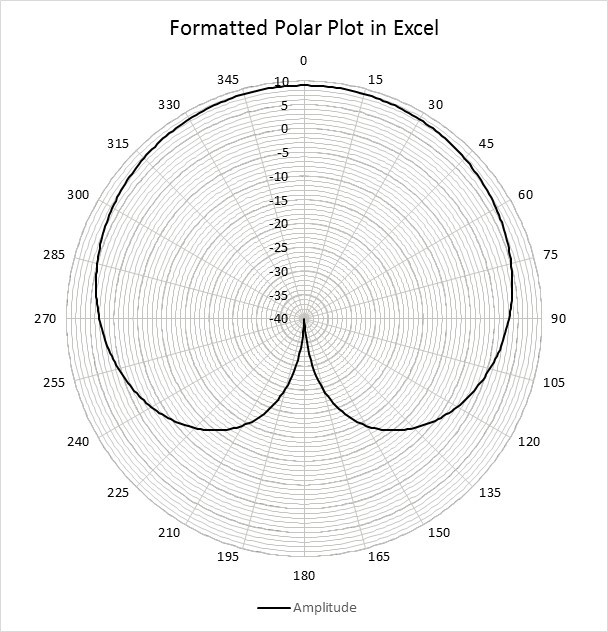
Excel is a great tool for engineering data reporting due to its widespread use. However, it has never supported a good polar plot which is an essential plot type in multiple engineering disciplines, including acoustics. The major workarounds I’ve seen are to either download a plugin (which is difficult if you don’t have admin rights) or convert (theta,R) into x=R*cos(theta) and y=R*sin(theta) and use a scatter plot. However, the latter method can take up a lot of spreadsheet space -especially if you have multiple sets of data.
It turns out the chart type that you always thought should be able to plot a polar – the Radar Chart – CAN do it; however, there is still some frustration with the formatting of axes. Thankfully, if you work through the frustration once and save the completed chart as a template, it’s much easier to reuse future data sets. See the below attachment for instructions using Excel 2016. There are some differences with older versions, but hopefully you can follow along also...
It turns out the chart type that you always thought should be able to plot a polar – the Radar Chart – CAN do it; however, there is still some frustration with the formatting of axes. Thankfully, if you work through the frustration once and save the completed chart as a template, it’s much easier to reuse future data sets. See the below attachment for instructions using Excel 2016. There are some differences with older versions, but hopefully you can follow along also...
| iar-_polar_plots_in_excel.pdf |

 RSS Feed